JOURNAL / INDEXPFXAMD — ENGINEERING NOTEBOOK
Digital design / visual
Mobile is a composition, not a smaller desktop
Responsive work becomes stronger when the same content is deliberately re-composed for a different screen.
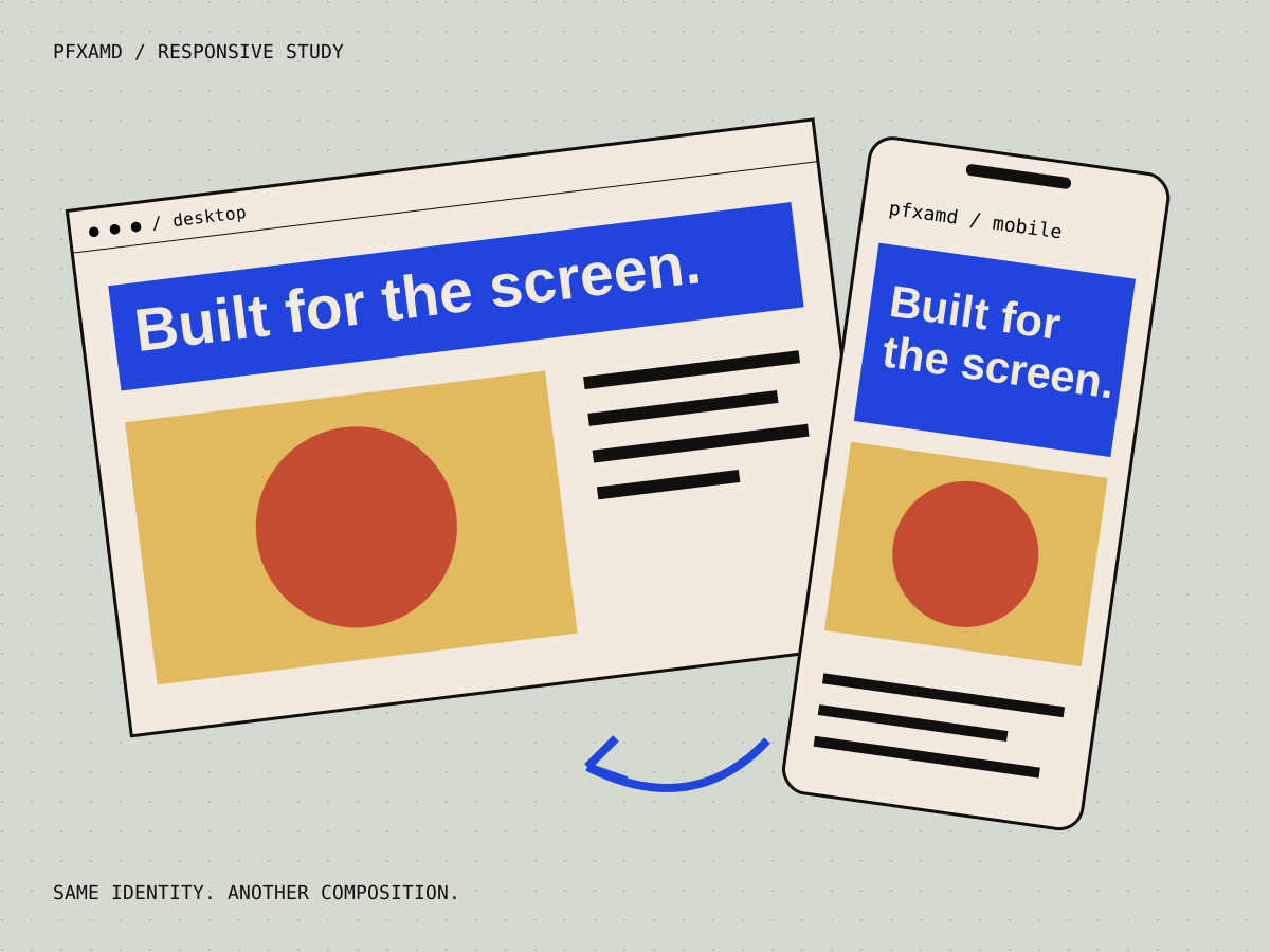
A desktop composition can use distance, overlap, negative space, and large gestures that do not survive by simply shrinking everything.
The content can stay the same while the art direction changes. Elements move, hierarchy changes, motion is simplified, and the page finds a rhythm that belongs to the phone instead of imitating a wide screen.